In my downtime, I’m continuing to tweak the web site’s layout and design a bit. My main goals are to make it look cleaner so that the content gets the bulk of the attention. The other is to reduce the page file size by removing a lot of legacy cruft in various HTML templates that have been there since the late 90’s. Yes, late 1990’s!
I will keep updating this thread as I get more ideas thrown in, but first - here is my take on what the home page should look like:
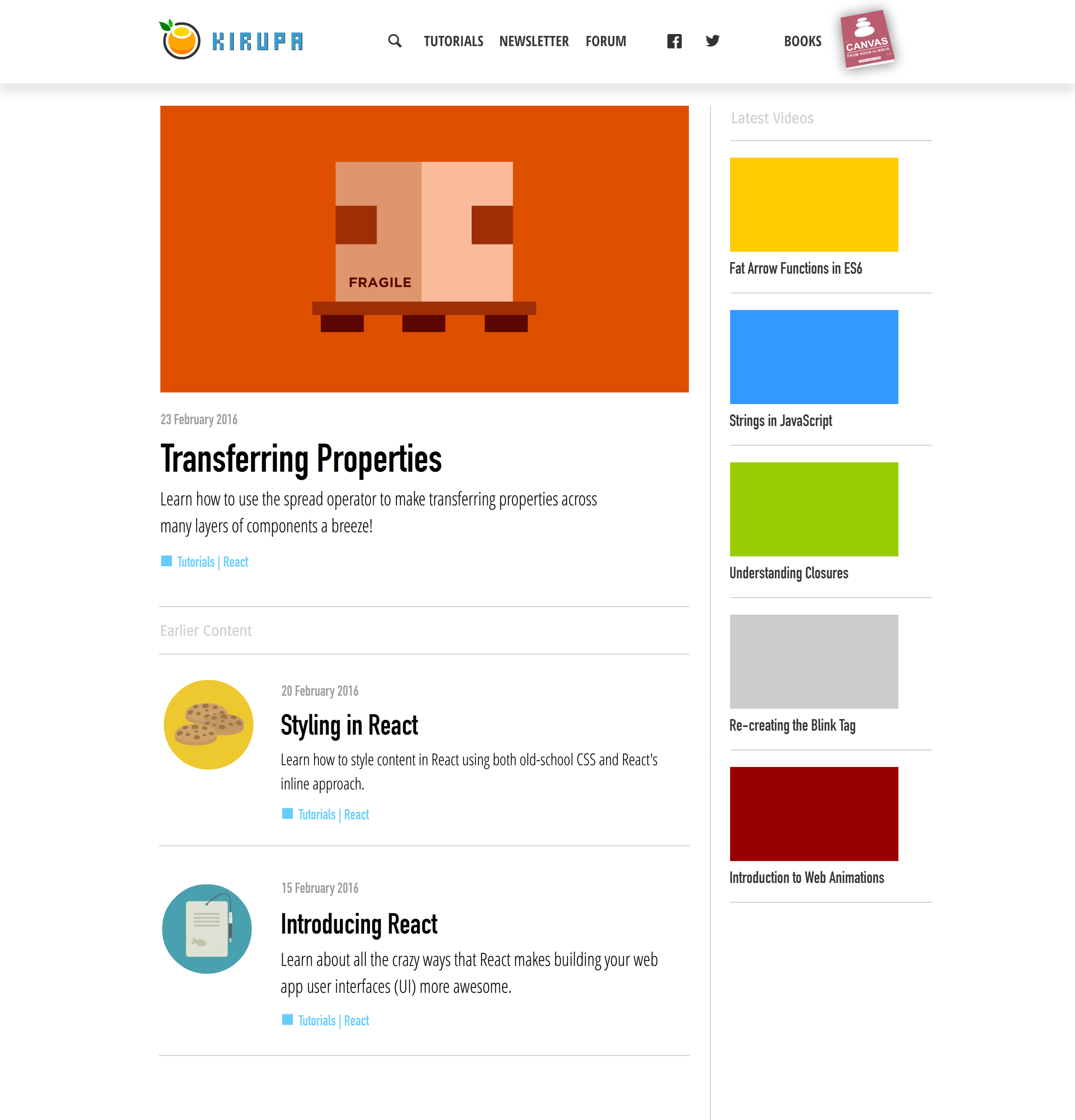
What’s the square thing before “Tutorials | React” ?
Nav ordering is interesting: A search icon, then three text things, then two icons, then some random space, then a text+large icon thing for your books. Could be fine, but I have no idea why the ordering is the way it is there.
What does this look like on a really wide monitor? Looks like it’d be wonderfully responsive for phones and such as is.
Dropshadow in the header looks too light given how long (in height) it is. I’d expect a darker start to the gradient given how large it is.
Proper pluralization (?) is '90s and 1990s, I believe.
More broadly, related to the widescreen bullet above, I think the design reflects the skinniness of your historical design. Sort of like how 960px grids were popular in ~2009. Here it looks like you’re fitting your overall width based on the old widths that made sense when you first made the site.
Not enough margin between the main column and the secondary right column?
Why don’t the second column thumbnails fill the whole remaining width of the dropshadow area above?
What’s the width of the paragraph below the main orange title image? You’d think that “across many layers” wouldn’t wrap as soon as it does in this comp.
The date format looks a bit weird for an American audience, if that is your primary audience. Not that it’s difficult to read, but DD M YYYY reads, if nothing else, a bit more like British English to me.
There’s a newletter?! Sign me up!!!
Dropping the .com is still okay with me.
I think it’s a bit too self-aware to call your content content. (=
The square thing is just a design element. It doesn’t have to be there. Tutorials and React will each be links that take yo to their respective page. This solves one of my personal frustrations with the site. When seeing a tutorial, you have no way of seeing other related tutorials in that category.
I think of the books as more of an “ad” or marketing thingy. That is why I right-aligned them. With that said, that does look a bit odd. I’ll play with that a bit more.
The width of the page will be fixed to mimic the width of a book, but making it responsive for phones is one of the big goals.
Good point. I’ll play with that. Longer term, I don’t want a plain white header. I would like for its background color to be customizable a bit…just like this site had many years ago when the header was done entirely in Flash!
English Sminglish!
I should increase the width to something that is wider than 960-ish, right?. The content pages will have no 2nd column - at least as I am thinking about it right now. It will just be one column with just the article. Going too wide might make the reading experience a bit funny. Let me get some visuals up for what those sections look like as well.
The drop-shadow area is similar to how the site is today where the content of the header is centered on some fixed width. The drop-shadow itself extends the full width of the monitor. I am keeping all of the content (the 1st and 2nd column) constrained to that same artificial width.
Yep! That was a mockup bug. I’ll fix that when uploading some revised visuals
I really wanted to avoid commas. A lot of the papers I wrote in high-school and college used that way of specifying the dates, so I never thought much about it haha.
There is, but I haven’t actually sent anything on it. If you scroll towards the bottom of any part of the main site, you’ll see a dark area with the site logo and a field where you can enter your e-mail address and sign up.
It looks weird. Maybe I am just too accustomed to seeing it there!
Haha. I’ll revise that to say something like Tutorials!
Looks nice. I actually like the dropping of .com. Keep the dates as they are (British English is far superior to American ;)). Maybe I’ll be more constructive at a later date (ie after I have some unearned yet sorely needed sleep).
Adam - do you have an example of what you mean about putting posts horizontally as opposed to vertically? Are you referring to the new videos or the new tutorials?
Like here: http://www.theguardian.com - you’ve got two posts below the header, one next to another. It looks neat and it’s easier to read. By the way, The Guardian made a lot of studies before they launched their new website and - “Indicators such as eye-tracking and heat maps revealed that the long vertical columns of text, which in a way reflected the layout of the newspaper, were not conducive to an engaging reading experience.” (qoute frome the article: https://www.journalism.co.uk/news/key-principles-behind-the-new-guardian-website/s2/a563921/). Of course it’s an onilne newspaper but also a good benchmark.


 And more seriously, have you thought about putting posts below header horizontal not vertical?
 Hope you will show us soon some updates of your project. Good luck!