Very sweet on the minimals. It looks so sleek and smooth. The photos are nice!
I’m not shure how I feel about the position(maybe size) of the public/private entrance buttons. They just seem at a strange place.
Looks great! I don’t think I could pull that off half as nice, great job!
Yeah, I know… I was thinking the exact same thing when making the links, but I really tried to keep everything very simple to have a clean look. So until I have a brilliant idea for a new position or size of the entrances, I’ll leave it like this.
Nice minimalistic site! Just a question though… did you get that frog logo from Bullfrog Interactive (defunct company that formed Lionhead after dissolving)?
Not at all… I had no idea Bullfrog Interactive existed in the first place.
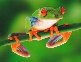
I created this logo about a year ago, using a picture of a frog that I found on the Webshots website to get the silhouette right:
Why? Is it that similar? Besides, the frog you see in my logo (or the one in the above picture) is a green tree frog. A bullfrog looks much fatter and has completely different toes:
I wasn’t accusing you of stealing or anything! I was just wondering because it’s a pretty similar logo.
Yours is a completely different image, but the logo just looks similar. (silhouette of a frog pointing up).
Those guys rocked man. Theme Hospital/Park , Dungeon Keeper series, Syndicate series… sigh Peter Molyneux came from that company (maker of Black & White, Fable, B.C. etc)