Given the fact that I am using a grid here - what is the approach I should be using here for vertical alignment of the contents. I thought it might be
display: flex but I don’t know if that’s compatible with the container being assigned display: grid
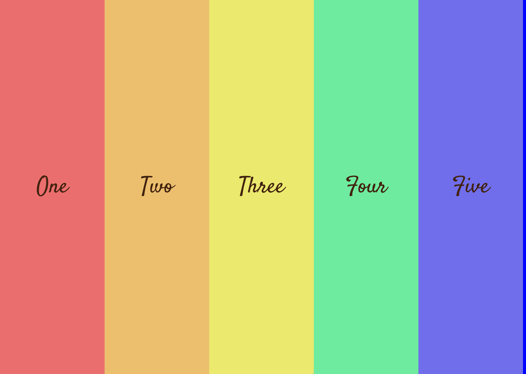
<html lang="en">
<head>
  <meta charset="UTF-8">
  <meta name="viewport" content="width=device-width, initial-scale=1.0">
  <title>Auto Fill vs Auto Fit</title>
  <link rel="preconnect" href="https://fonts.gstatic.com">
<link href="https://fonts.googleapis.com/css2?family=Satisfy&display=swap" rel="stylesheet">
  <style>
    .basket {
      width: 700px;
      height: 500px;
      border: blue solid 4px;
      display: grid;
      grid-template-columns: repeat(5, 1fr);
      }
      body  {
        font-family: Satisfy;
        font-size: 30px;
        color: rgb(65, 34, 15);
        }
      .one  {
        background-color: rgb(235, 110, 110);
      }
      .two  {
        background-color: rgb(235, 191, 110);
      }
      .three  {
        background-color: rgb(235, 233, 110);
      }
      .four  {
        background-color: rgb(110, 235, 158);
      }
      .five  {
        background-color: rgb(112, 110, 235);
      }
  </style>
</head>
<body>
  <div class="basket">
    <div class="one">One</div>
    <div class="two">Two</div>
    <div class="three">Three</div>
    <div class="four">Four</div>
    <div class="five">Five</div>
  </div>
</body>
</html>
Sorry just to clarify, you have 5 divs laid out in 5 columns on your basket element. Are you wanting to align the content of the divs (I assume you will add content and make them like cards) so that the content lines up?
Totally my fault that I didn’t clarify my question. By content, I am simply referring to the five numbers and what I want to do with them is to center all five so that they appear in the middle (vertically). Should be easy I know, but I don’t know whether it can be done while display is set to grid or do I have to rewrite the code using display: flex ?
There’s no reason you cant use both. Your wrapper div ‘basket’ is a grid parent element. The numbered div’s are grid children. The numbered children can also be flex parents (the text is the flex children or if you a put a h3 with the text inside, the h3).
This should work. (add center class to child elements)
.center {
display: flex;
justify-content: center;
align-items: center;
height: 150px;
width: 300px;
background-color: red;
}
If you want the flex boxes to expand shrink and stack use grid to to achieve that.
<!DOCTYPE html>
<html lang="en">
<head>
  <meta charset="UTF-8">
  <meta name="viewport" content="width=device-width, initial-scale=1.0">
  <title>Auto Fill vs Auto Fit</title>
  <link rel="preconnect" href="https://fonts.gstatic.com">
<link href="https://fonts.googleapis.com/css2?family=Satisfy&display=swap" rel="stylesheet">
  <style>
    .basket {
      width: 700px;
      height: 500px;
      border: blue solid 4px;
      display: grid;
      grid-template-columns: repeat(5, 1fr);
      }
      body  {
        font-family: Satisfy;
        font-size: 30px;
        color: rgb(65, 34, 15);
        }
      .one  {
        background-color: rgb(235, 110, 110);
      }
      .two  {
        background-color: rgb(235, 191, 110);
      }
      .three  {
        background-color: rgb(235, 233, 110);
      }
      .four  {
        background-color: rgb(110, 235, 158);
      }
      .five  {
        background-color: rgb(112, 110, 235);
      }

  </style>
</head>
<body>
  <div class="basket">
    <div class="one center">One</div>
    <div class="two center">Two</div>
    <div class="three center">Three</div>
    <div class="four center">Four</div>
    <div class="five center">Five</div>
  </div>
</body>
</html>
Hey mate,
I don’t know how this isn’t working. It works in Chrome and Firefox haven’t checked Safari. If you want IE you will need to use ms-grid-cloumn syntax, look it up.
Paste exactly this in your style tag:
.basket {
width: 700px; height: 500px;
border: blue solid 4px;
display: grid;
grid-template-columns: repeat(5, 1fr);}
body {
font-family: Satisfy;
font-size: 30px;
color: rgb(65, 34, 15); }
.one {
background-color: rgb(235, 110, 110); }
.two {
background-color: rgb(235, 191, 110); }
.three {
background-color: rgb(235, 233, 110); }
.four {
background-color: rgb(110, 235, 158); }
.five {
background-color: rgb(112, 110, 235)}
.center {
display: flex;
justify-content: center;
align-items: center;}
Good Luck
.center {
display: flex;
justify-content: center;
align-items: center;}
Thank you! Your code does work - in Safari I might add since I am on an iMac. A really good lesson for me in that I had forgotten that you can have more than one identifier for the class attribute. So the key to solving this problem was to apply the “center” identifier to all 5 divs - after that it’s easy to see how the 3 lines of the above code placed the numbers exactly where I wanted them. So easy to solve the problem once the solution is pointed out to you but honestly, I couldn’t have come up with this approach on my own. It’s all good now though!