I was, i did the best spelling my memory could do. How are you getting the icon that shows who you’re relying to?

Though it won’t show if your reply is directly below the person you’re replying to.
1 Like
At least I thought that’s what it was. Maybe it doesn’t show if the replied-to post is the last one?
Ah yes thats what confused me.
E-mail sent! 
1 Like
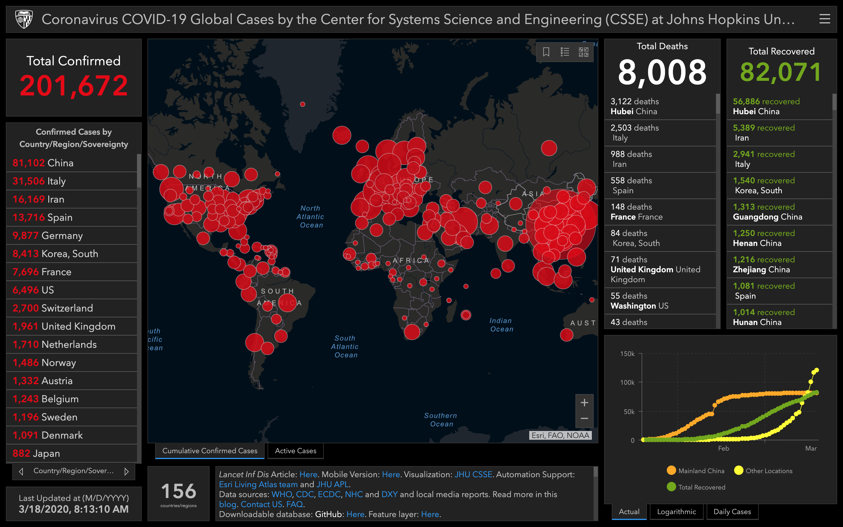
Another week. China still flat while “Other Locations” are taking off. Last weeks confirmed case count was a 28% increase while this week, the increase was 66%. While Italy is still bad, places like France and Germany are worse in terms of new cases, seeing a 6x increase. …though I wonder how much of this could be attributed to availability of testing? One thing is for sure, now that Greenland is on the board, you know things just got real.
All that red in your weekly updates is getting a bit like …

1 Like
Some of you may recall (probably none) that my username prg is relative to Prague Czech Republic, much like Venice and elsewhere its now an eerie feeling with no people.

EDIT: Already in lockdown, it was just announced by the Czech president that masks are now mandatory for everyone in public, groceries, etc.,
I hope this isn’t callous of me, but it would be quite a surreal experience to walk through a deserted city like Prague.
This is nicely done.
Some interesting graphics that appeared on Reddit today.
The first from a subreddit called /r/agedlikemilk:
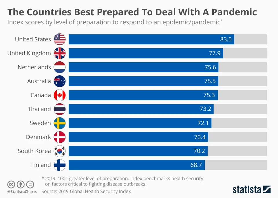
Why is that on agedlikemilk? That brings us to our next graphic from /r/worldnews linking to a forbes article titled Confirmed Coronavirus Cases Are Growing Faster In The United States Than Any Other Country In The World:
Best prepared / yet fastest growing cases. Those two stats don’t sound too encouraging comparatively speaking. But I guess the former will be tested by the latter. 

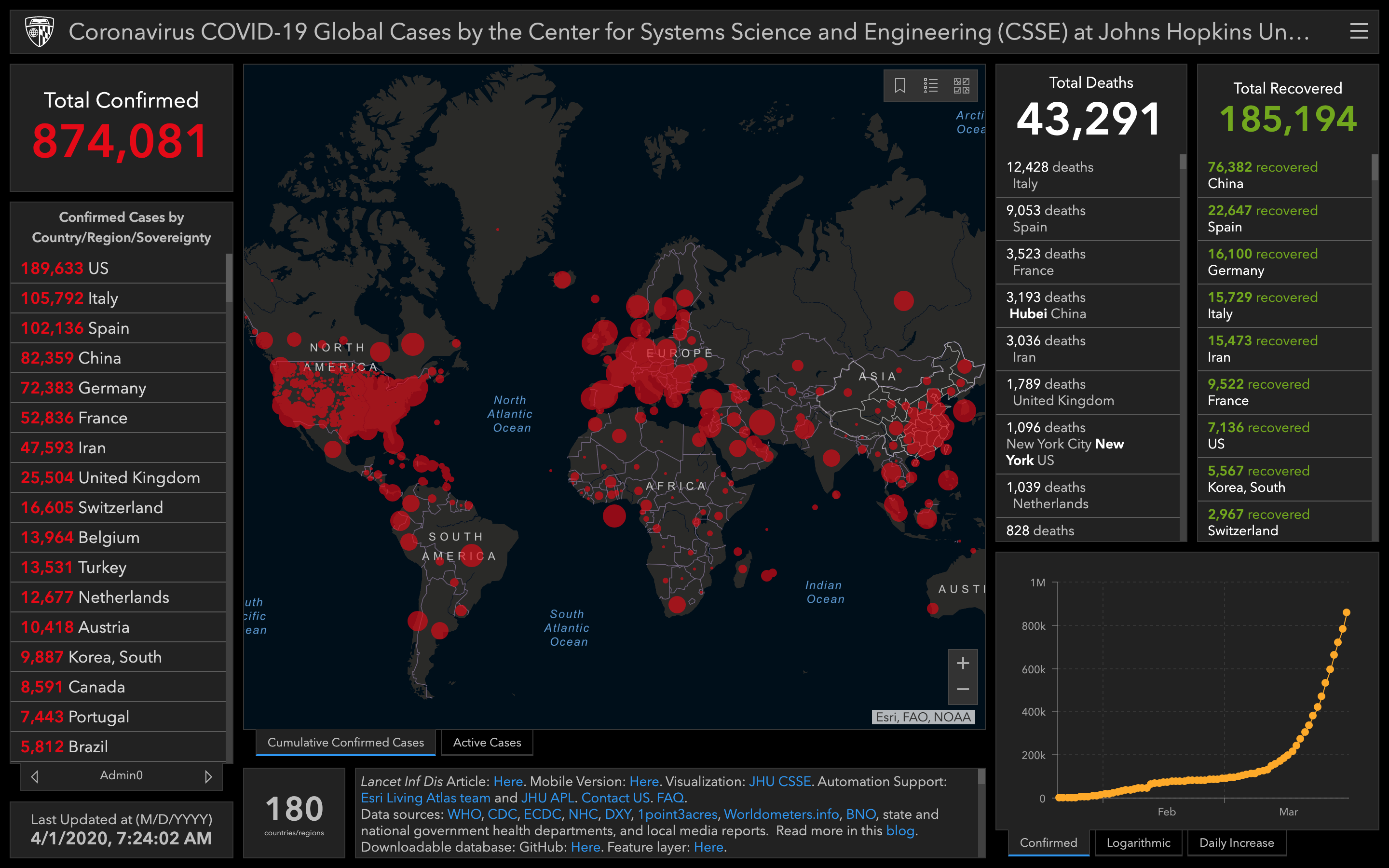
This week: Some changes in the presentation here, notably, the chart in the bottom right is only showing confirmed cases and a logarithmic scale is no longer an option. The red dots are also smaller, a little more faded and without an outline. This makes the impending doom seem less prevalent and helps with the visualization since it helps us see a little more… kind of.
More importantly is the data itself. Despite not seeing it in the chart anymore, China is still flat, only a few more cases added to their count - which probably explains their omission from the chart. But looking at things overall, both cases and deaths have more than doubled. This is a greater increase than the change from last week, though recoveries have topped 100k which is nice (an increase not nearly as fast as the increase in cases).
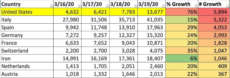
Additionally, as with data reported earlier in the thread, cases in the US have skyrocketed. The US is now #3 for most cases, closely coming up on Italy, and with an increase far greater (Italy a little more than doubled, US around 9x more).

Small update on top 3:
- 81,782 China
- 80,539 Italy
- 75,233 US
It’s a very close race to who will pass china first. If it is actually Italy (looking that way) we could miss it at the pace US is going since it will surely pass Italy not soon after. I think it will depend on when the data is updated (current numbers from 3/26/2020, 1:26:21 PM).
Edit: NVM, US has this in the bag
- 81,782 China
- 80,589 Italy
- 80,021 US
@ 3/26/2020, 4:29:16 PM
Edit 2: And there it is
- 82,404 US
- 81,782 China
- 80,589 Italy
@ 3/26/2020, 5:37:36 PM
1 Like
Another week, another screenshot. No real surprises here. Cases continue to rise, especially in the US. US death totals have now surpassed China’s, though there has been reporting on a lack of accuracy around the China numbers. Nevertheless, it sounds like things in Wuhan are starting to get back to normal. But I think the US has yet to see the worst of it. At least people are starting to take it more seriously there now so hopefully we’ll see a reflection of that in the numbers soon.
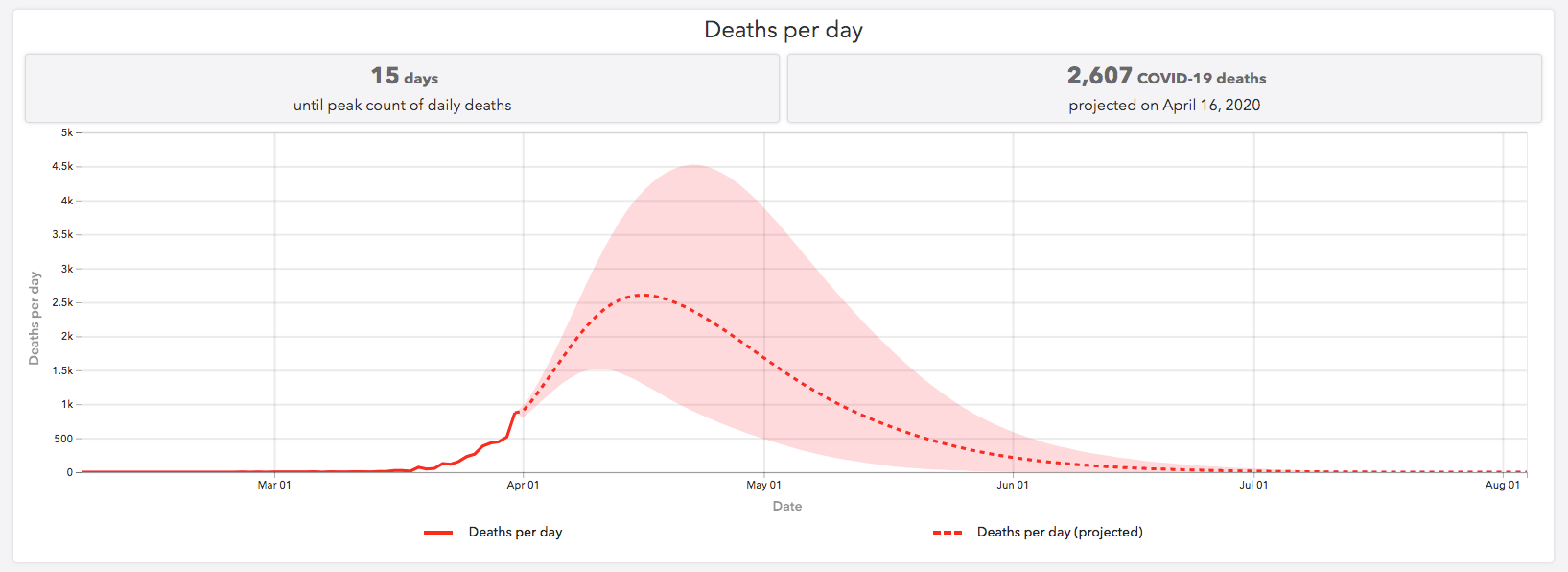
More charts
1 Like
Excellent interview