This is nicely done.
Some interesting graphics that appeared on Reddit today.
The first from a subreddit called /r/agedlikemilk:
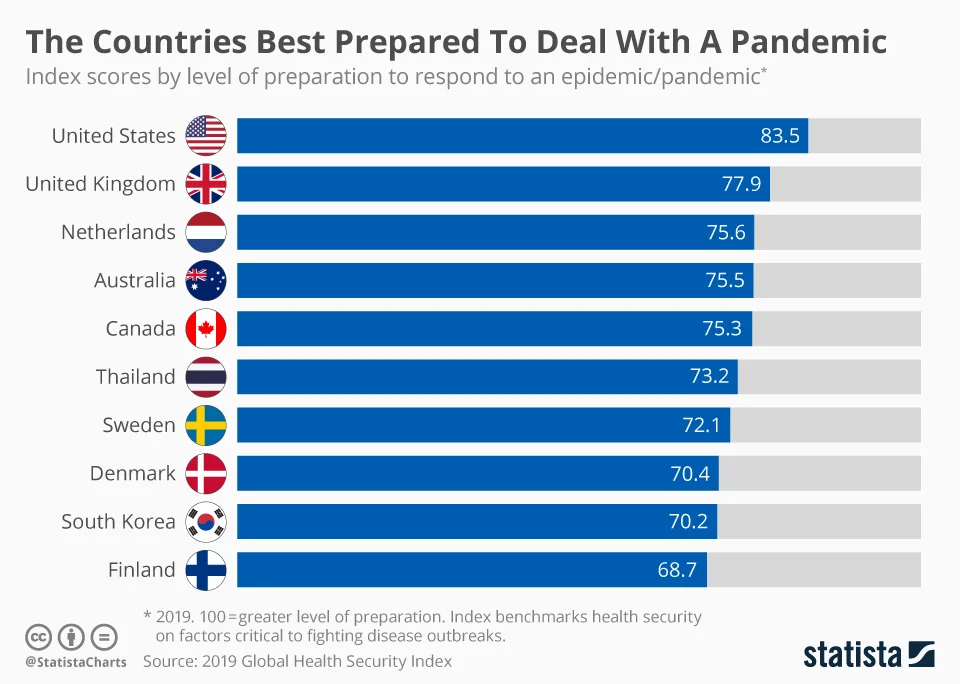
Why is that on agedlikemilk? That brings us to our next graphic from /r/worldnews linking to a forbes article titled Confirmed Coronavirus Cases Are Growing Faster In The United States Than Any Other Country In The World:
Best prepared / yet fastest growing cases. Those two stats don’t sound too encouraging comparatively speaking. But I guess the former will be tested by the latter. 

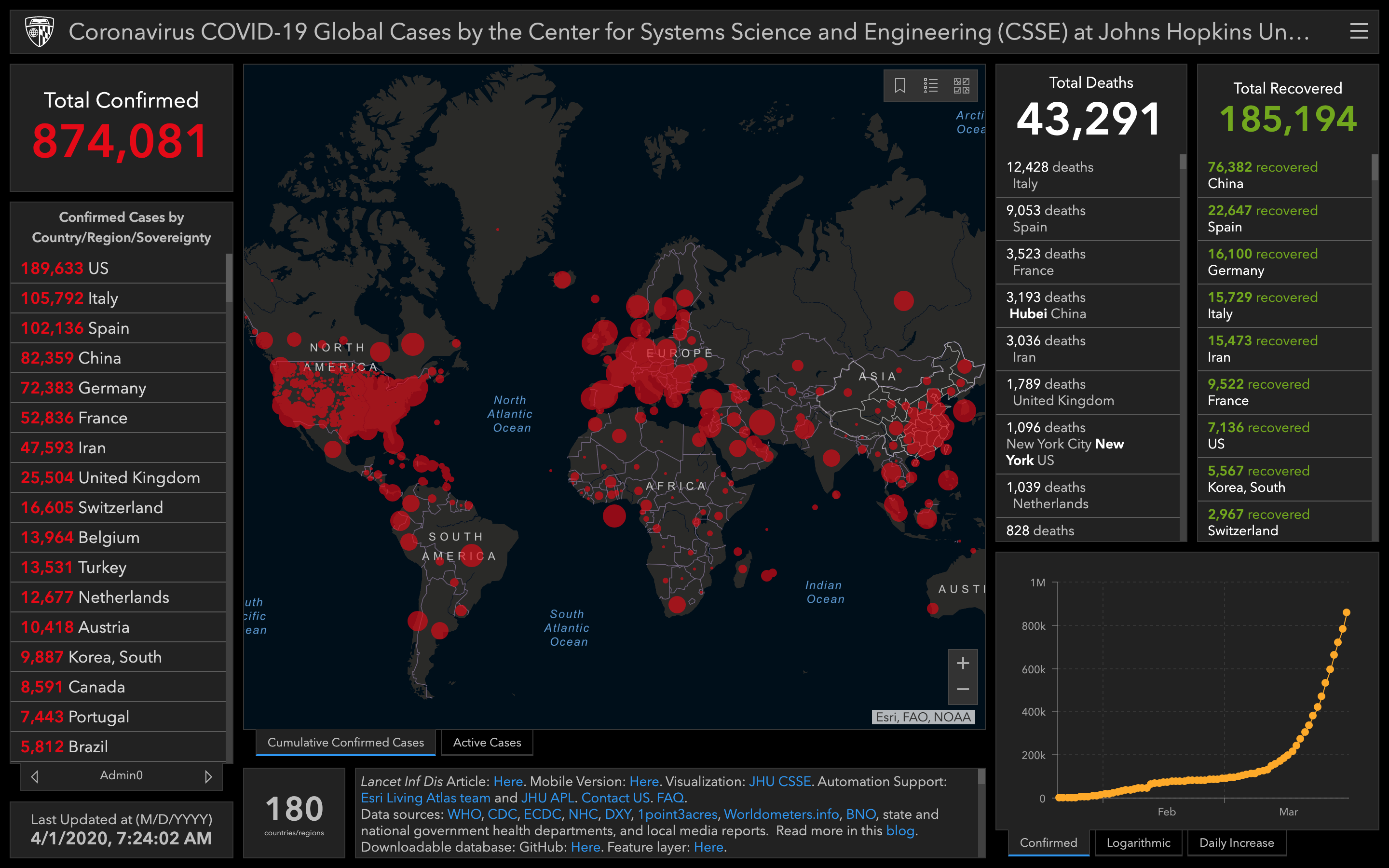
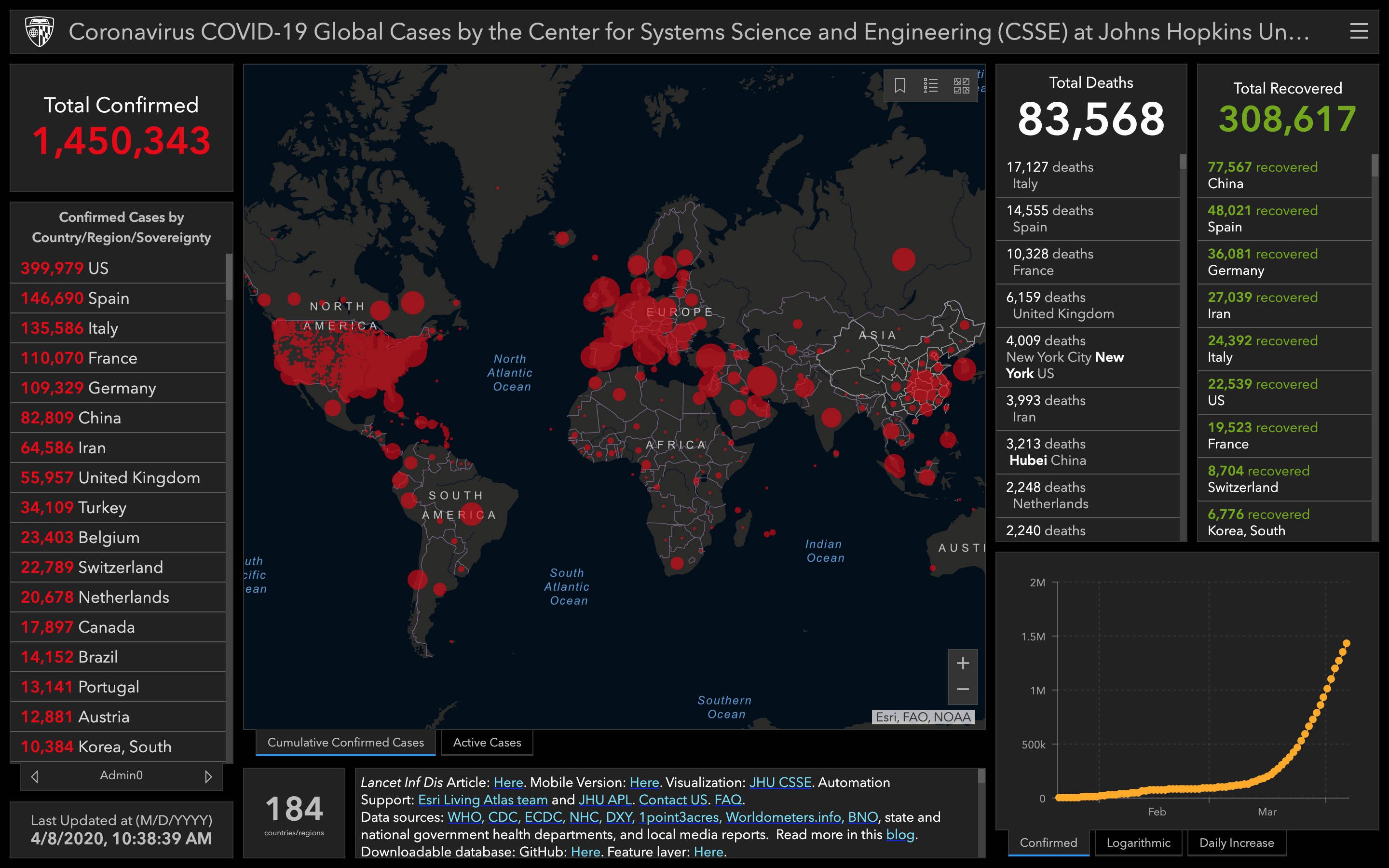
This week: Some changes in the presentation here, notably, the chart in the bottom right is only showing confirmed cases and a logarithmic scale is no longer an option. The red dots are also smaller, a little more faded and without an outline. This makes the impending doom seem less prevalent and helps with the visualization since it helps us see a little more… kind of.
More importantly is the data itself. Despite not seeing it in the chart anymore, China is still flat, only a few more cases added to their count - which probably explains their omission from the chart. But looking at things overall, both cases and deaths have more than doubled. This is a greater increase than the change from last week, though recoveries have topped 100k which is nice (an increase not nearly as fast as the increase in cases).
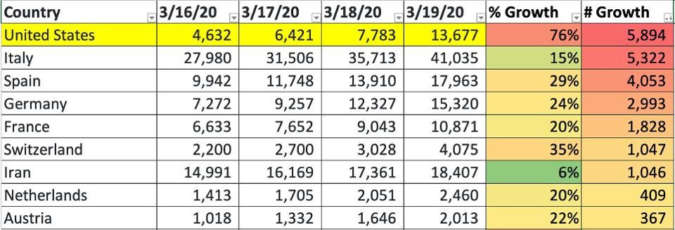
Additionally, as with data reported earlier in the thread, cases in the US have skyrocketed. The US is now #3 for most cases, closely coming up on Italy, and with an increase far greater (Italy a little more than doubled, US around 9x more).

Small update on top 3:
- 81,782 China
- 80,539 Italy
- 75,233 US
It’s a very close race to who will pass china first. If it is actually Italy (looking that way) we could miss it at the pace US is going since it will surely pass Italy not soon after. I think it will depend on when the data is updated (current numbers from 3/26/2020, 1:26:21 PM).
Edit: NVM, US has this in the bag
- 81,782 China
- 80,589 Italy
- 80,021 US
@ 3/26/2020, 4:29:16 PM
Edit 2: And there it is
- 82,404 US
- 81,782 China
- 80,589 Italy
@ 3/26/2020, 5:37:36 PM
1 Like
Another week, another screenshot. No real surprises here. Cases continue to rise, especially in the US. US death totals have now surpassed China’s, though there has been reporting on a lack of accuracy around the China numbers. Nevertheless, it sounds like things in Wuhan are starting to get back to normal. But I think the US has yet to see the worst of it. At least people are starting to take it more seriously there now so hopefully we’ll see a reflection of that in the numbers soon.
More charts
1 Like
Excellent interview
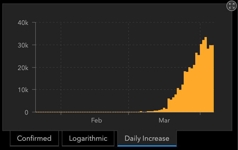
This one is interesting given that it seems to include incomplete data from today (which isn’t over yet). I wonder if, when that data changes, so too would the projection? This especially given the spike from yesterday.
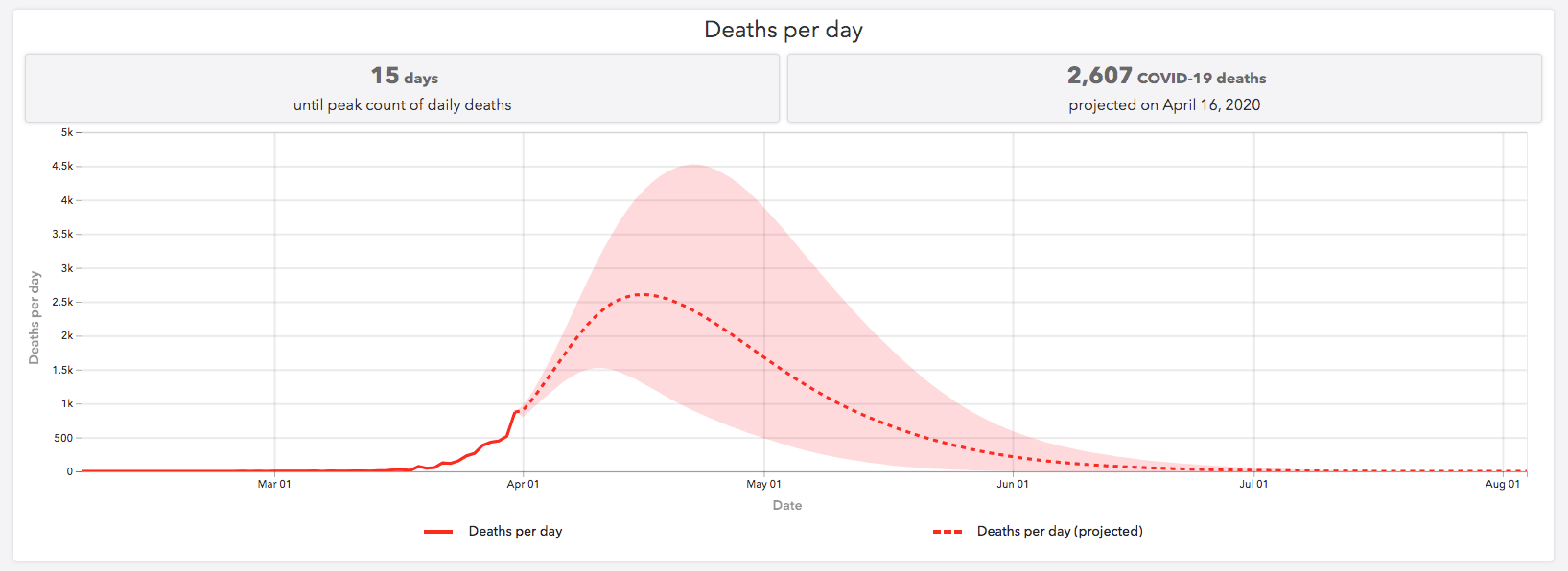
I was wondering the same. The CT map where i live is a bit frightening. (Although far lower overall than some) We’ll see what the projection looks like in a day or two… hopefully yesterday was an anomaly, but doubtful.

Wow the mobile version doesn’t help either. Spikes look extra spikey 
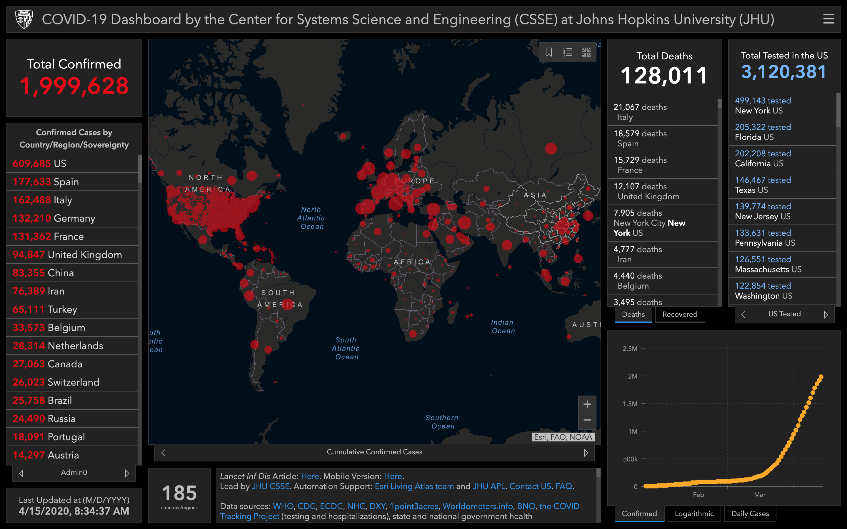
This week, US hit 400k cases (effectively). This is far more than double of any other location. Speaking of which, Spain jumps to #2 this week, passing Italy which seems to have been getting things under control with far fewer new cases.
On the brighter side, it looks like the US (and the world in general) is finally starting to see fewer new cases too.
This is undoubtedly thanks to social distancing. The question will be whether this trend will continue once quarantine mandates are lifted. We could very well see new cases spike again. So while it looks like we’re starting to see the light at the end of the tunnel, the threat is not, and will not, be gone any time soon.
1 Like
Without a vaccine, I do wonder what “normal life” will look like for the next year or so. One outcome is that testing is so prevalent and fast (like a matter of seconds before you get the result) that everyone is tested as they enter a building every single time. That seems very impractical.
Another approach is that with flattening the curve and such, low-risk individuals are free to roam about. There will be hospital capacity to deal with any issues. Those at high-risk will still be social distancing until a vaccine is available.
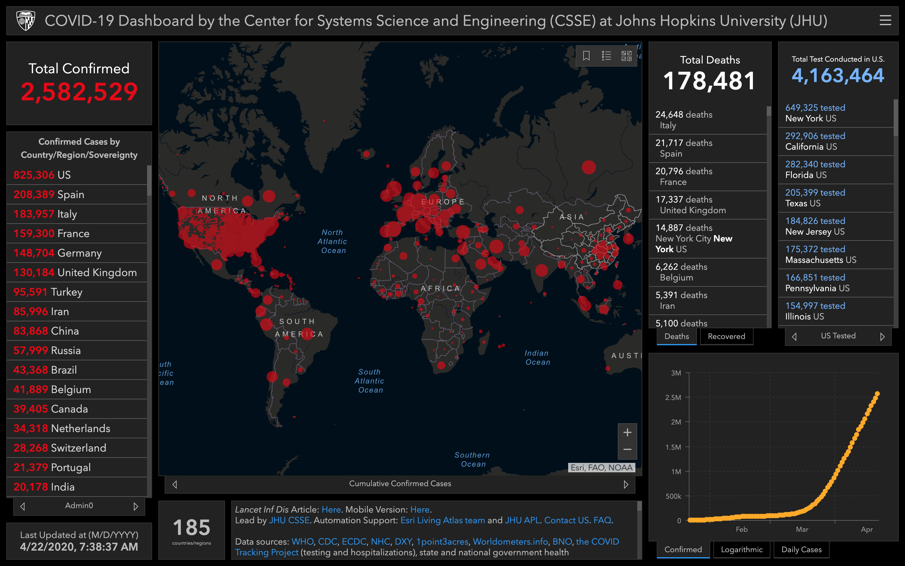
Week 8 of screenshots. Now at 2 million cases worldwide (again, effectively). U.S. is making up close to 1/3 of those numbers.
The map/site has also changed again, now reporting total tested in place of total recovered. Could that be related to Chile counting dead as recovered? (Probably not)
2 Likes
3 Likes
There is a new site that came online over the weekend by the creators of Instagram: https://rt.live/
It tracks the reproduction number to help identify how many secondary infections might occur in an area.

1 Like
I wonder why Kentucky is green when I just read KENTUCKY REPORTS HIGHEST CORONAVIRUS INFECTION INCREASE AFTER A WEEK OF PROTESTS TO REOPEN STATE. (Sorry, caps not mine)
Ok, KY is back in the red. How quickly things can change. And if you look at last week, we’ve gotten worse, going from around a dozen in the red to now around 20. And some of the best states from before are now the worst and vise versa.
No real surprises this week. Trends continue though slowly seem to be leveling off. US was apparently at the top of their curve for new cases but yesterday saw the highest spike yet so who knows. Protests are not making things better and there’s still concerns about lack of testing.
I can’t tell whether I’m flouting the quarantine by living my normal life or my normal life for the past four years has just been self-imposed quarantine.