Love it, u and Pasquale nailed it ![]() … its got that retro feel but at the same time really slick. Like getting a new Super Nintendo…
… its got that retro feel but at the same time really slick. Like getting a new Super Nintendo…
1 Like
That is exactly the feel we were going for! Now, all we need is some 8-bit video game background music. Which may not be a bad idea actually!
1 Like
The changes are slowly starting to go live! I am updating the fonts on the tutorial pages with a handful of glitches that I will slowly address momentarily.
1 Like
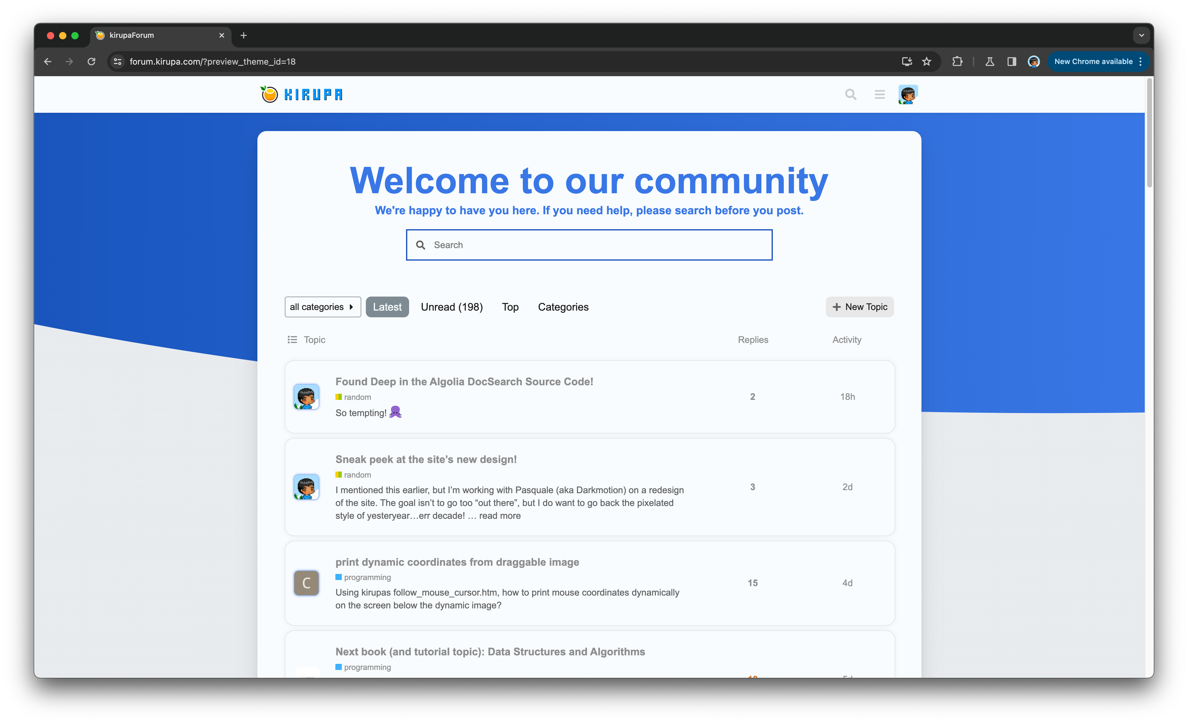
The next frontier here will be updating the look of the forums. I am likely going to be tweaking this official theme, which you can preview by clicking here!
It looks great
I hope you have a pixelated sun (and moon for the dark theme) ![]()
Yep, the forum needs it! just a pixelated bkg blue would be a huge difference.
2 Likes
Regarding the pixelated sun and moon, that is a great idea!
2 Likes
Still haven’t forgotten about making the forums look nicer! Here is a theme from Discourse that seems like a good candidate to use here and then modify with the more pixel-themed visuals. Thoughts?
Love it, Pasquale and you did a great job:a tiny smile on my face: It’s incredibly sleek and has that vintage vibe all at once. Such as purchasing a new Super Nintendo
Thanks
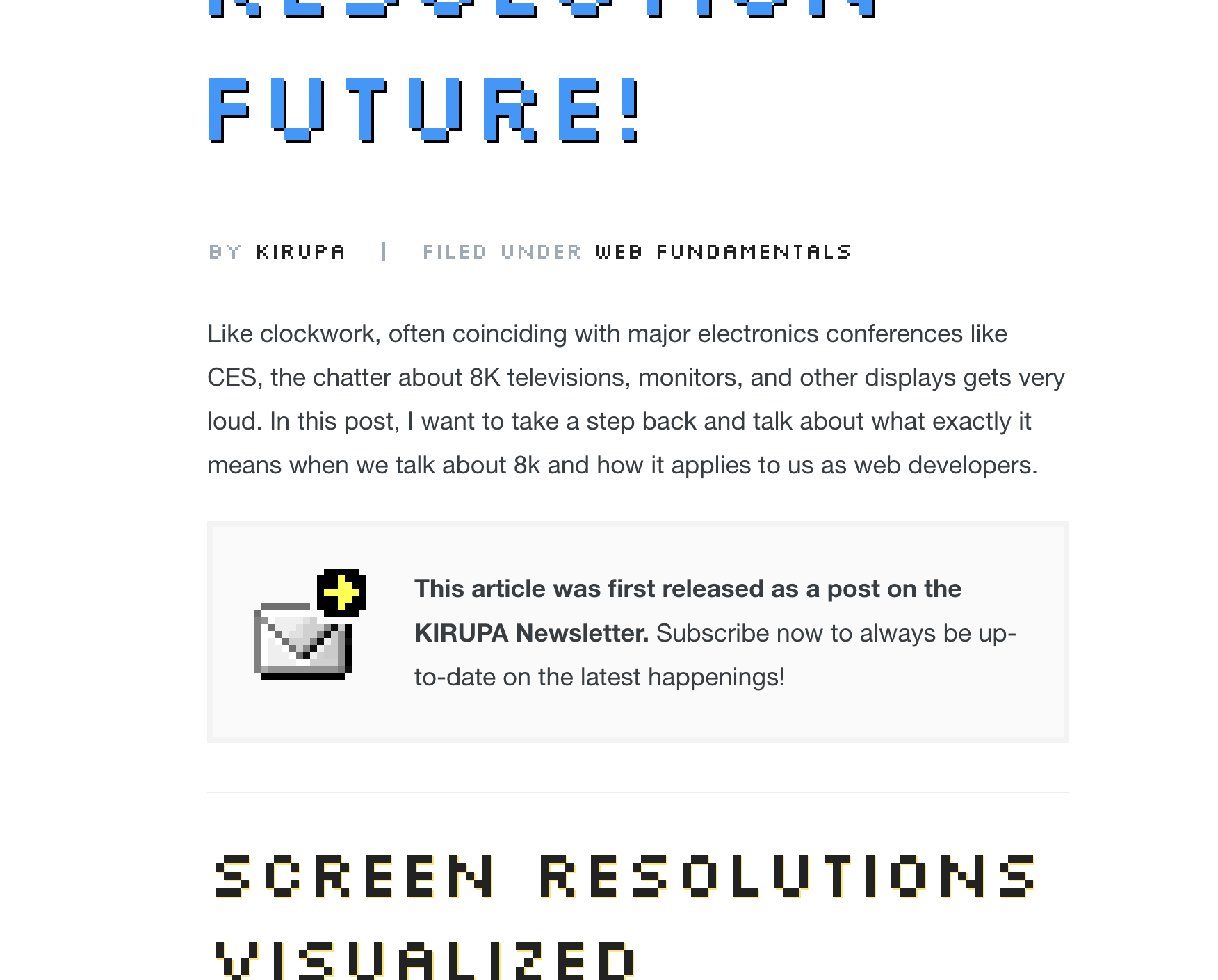
More design updates! This time, the typography has been cleaned up a bit.
Plus, we now have a revised footer:
All of this is still a WIP, but I do hope to be getting closer to wrapping up the main site work and then shifting to the forums in a week or so.
1 Like
Love it!. Looks great
Almost reaching the end of all the changes. I’ve started updating the forums with the latest styles and fonts. There is still a bunch of little things to do, so I hope to tackle those tomorrow.
1 Like
The changes are slowly starting to go live. ![]()
The font looks pretty sweet, what’s the font?… or did you make your own?
1 Like
Not that, but the font is pretty cool! I didn’t make it myself. I don’t have those kinds of skills! ![]()
The font is Born2bSporty for the headings and Chakra Petch for the body. I describe those here: About this Site
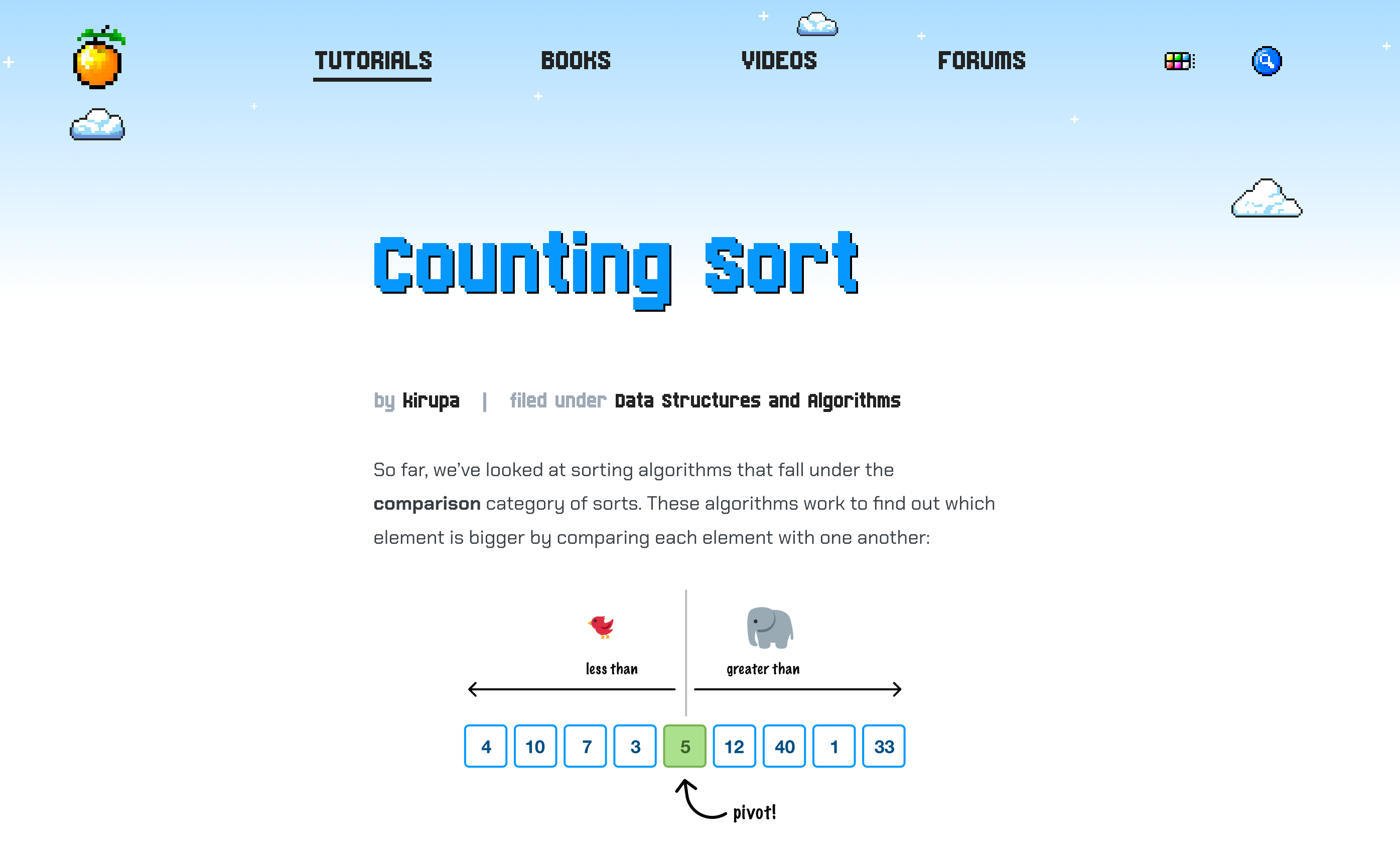
No, the thing I wanted to point to is the pixelated orange logo. I got permission from the original creator to use it as the site’s logo! ![]()
1 Like
Super cool that you got the original logo back!
2 Likes
Nice! Super clean. Love the dark theme [blue] feeling and customizations.
(sorry, can’t stop imagining those clouds moving super, super slow ![]()
Great job!
1 Like
Thanks! ![]()
Also, I just noticed that we don’t have moving clouds on the forums! That’s something I’ll try to fix in the near future.
2 Likes
This was so fun to jam on with you man!
2 Likes