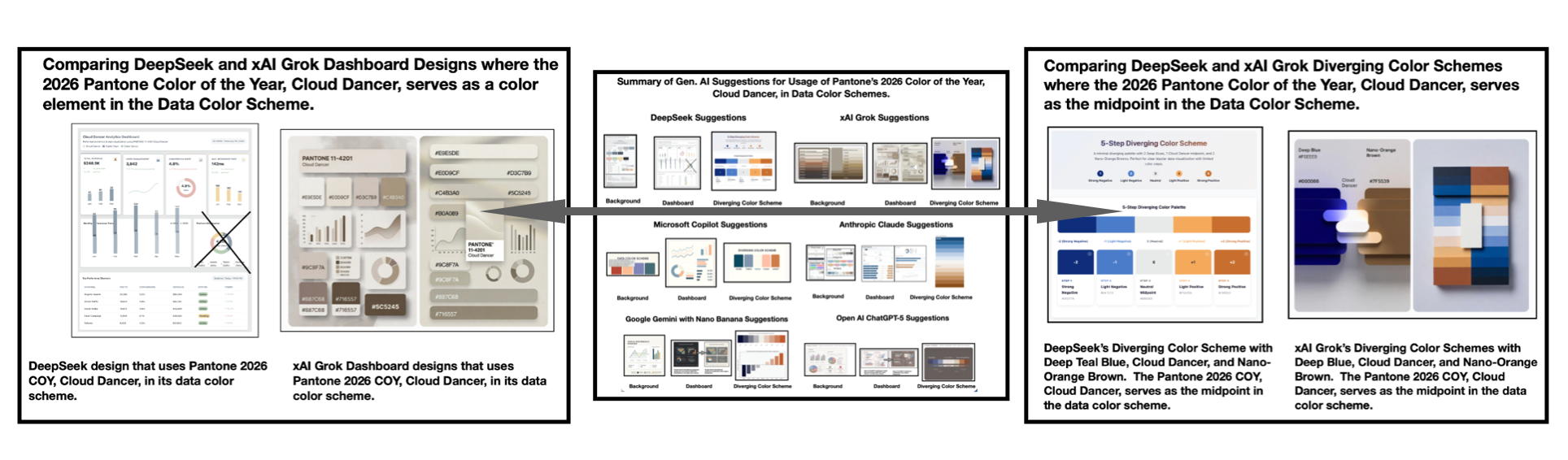
A design study using the 2026 Pantone Color of the Year to test how cloud-like palettes behave in data visualization, with DeepSeek and Grok as the framing lens.
The palette is interesting, but cloud-soft colors usually fail first on contrast once you put real dashboard density on top of them, especially with tiny legends and threshold states.
That’s the real failure mode, and I’d test the palette as a low-emphasis surface layer while keeping alerts, thresholds, and tiny labels on a harder neutral scale so the pretty bit doesn’t do the critical work.