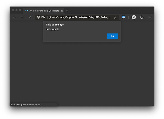
As part of updating some screenshots for the second edition of my JavaScript book, I was trying to capture a screenshot of the browser alert dialogs. What I saw in Chrome looked a bit odd, so I decided to see what these dialogs look like across other browsers. For kicks, I figured I would share my findings with all of you.
Here is Safari:
Chrome:
Edge:
Firefox:
Vivaldi:
Brave:
Of all these, the Safari one easily looks the best for me. The Chromium-based browsers (Edge, Brave, Vivaldi) unsurprisingly look similar. If somebody wants to expand upon this with screenshots from Internet Explorer, Edge on Windows, mobile browsers, etc., feel free to add on to this list ![]()
Cheers,
Kirupa


