


I think the first is the best nice color combination and don’t get so boring so fast.
3 too…
although 5 has nice pics (feathers) and 2 is layed out pretty well (lines that go behing glass…)
i liked first & last. The others are’nt easy to read for me.
i think the first one is the best design out of the 4
the first one 
numero uno (the nav’s the best and so are the colors). The last one is too washed out. I like the color combos of 1 and 2.
JC
2.jpg is my favorite, nice contrast bewteen the colors and more variety.
Yep - the first one, the colours are light and the design of the top half is held together well. The orange on the right balances it nicely.
The second is a bit too full on, with that image covering the entire right hand side. To my eyes the third just seems a little drab, the fourth looks simple, but perhaps too simple.
It doesn’t look like it need be done in flash.
5
3.jpg! :beam:
Client didn’t like the colors on 2.jpg
Client didn’t like the colors on 3.jpg
Client wanted more pics of actual works, so 5.jpg and 6.jpg are out.
Client likes this look but now wants his logo in a crappy brown color. So, http://www.beauchampmedia.com/clients/adamms/comps/2c.jpg is out.
Client now wanted something more like this http://www.beauchampmedia.com/clients/adamms/comps/12.jpg but with more images of lamps and art glass.
Oh well, it’s his money!
How are these?
http://www.beauchampmedia.com/clients/adamms/comps/14.jpg
http://www.beauchampmedia.com/clients/adamms/comps/16.jpg
http://www.beauchampmedia.com/clients/adamms/comps/15c.jpg
Sometimes I wonder why I didn’t stick with photography.
Ah yes, the annoying, but rich client. Can’t live with them, can’t live without them. 
I like 14.jpg, really clean and nicely laid out.
I agree with EG. “14.jpg” looks the best.
Marcellinus
Let me preface this by saying that I usually don’t look at site check requests, but since this one was for a glass site I couldn’t resist. I collect Victorian Era blue opalescent glass.
In my opinion there’s no contest, #2 hands down is the best one. It’s for an Art Glass site and that one does the best job of saying just that. Let the gorgeous glass be the “Wow!” just go with different colors.
I like 2c.jpg the best personally, but the client wanted 16.jpg.
What can you do?
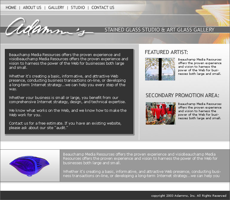
Here’s the front page laid out in HTML with a little flash animation.
Think it’s okay?
http://www.beauchampmedia.com/clients/adamms/site/
Thanks for the opinions and such too!
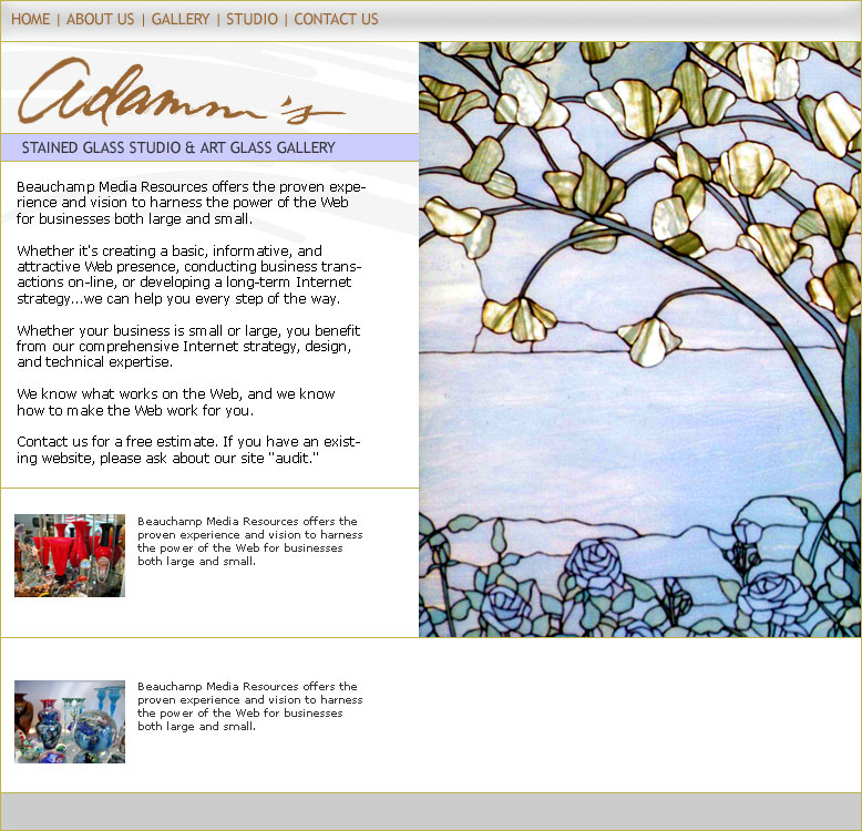
It’s not bad, I think it looks good. The colors might not be as dramatic as the other ones, but it’s still clean and organized. Clients are always right, even if they’re color blind. =)

:: Copyright KIRUPA 2024 //--