Sign critique

Hey I’m doing a exercise where I have to create a series of black and white signs using only graphics. I was wondering if anyone could say Yay or Nay on my designs. Basicaly we were given a topic and had to create a sign to represent that topic

Here are my first 2.

Construction

Playground

good start
both needs more work though
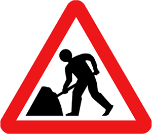
try to simplify the construction one more and for the playground maybe add a child on it (could be mistaken for missing children).
Do you have to keep the (2) signs in the same style? because right now they aren’t really the same

Nice idea,

For the first one, perhaps you could change his hands, the circles don’t suit him.
As for the second, looks nice and clean, i can’t think of any complaints.

I’d recomend studying these styles, see if you can get some ideas:

i think theyre too pictorial - a bit too much useless visual information - like the little blades of grass…

i dunno i just think that signage should be simple and effective

look at the angle the construction guy is taking to hit that nail.

I’ve tried adding a child to the playground one but me and my teacher both noticed it makes the sign too busy ( especially in B&W). Yeah the construction one needs a bit of fine tunning like the body shape, the hard hat and the way he’s holding the nail. The only style outline is that it has to be in black and white and have no text.

Cheer for the comments

these should also work scaled down to icon size, so keep that in mind. thus, you should avoid really thin lines and getting too detailed.

LOL:krazy: :krazy: :krazy: :krazy: :krazy: :krazy: :krazy:

hes gonna get a thumbfull of hammer - thats if hes lucky :stuck_out_tongue:


Construction Redo


This one’s for a Beach Bus Stop, I’m having a few issues with it.

okay, now do you think people nail something at an angle? not very often, right? you may want to look at what ritual posted, and add some detail…
(i don’t know, there’s not much info given in your original post… so i don’t know if you have to add detail or not)

i like beach bus stop. that’s good. :slight_smile:

I might zoom in on the image, Move the nail higher and make it horiztonal and remove the right arm.

The only rules are that it as to be in Black n white and have no text.

okayie guys how about this for an underconstruction signboard… not really a board…but… check it out…

here

:expressionless:

thanks for wasting 5 seconds of my life.

ehh!!;( it wasnt that bad… COME on my first try…:cyclops:

:ponder:

scary stuff …:snooze:

Good for you, go and post in your OWN thread.

This is one I made for Supermarket

^^^ that one could be comfused for alot of things, IMO. Maybe try doing a shopping trolley?

tried that but it could be confused for the trolley bay signs where you return the shopping r=trolleys to.