Websites that change drastically depending on the browser width are bound to be bad.
http://host15.ipowerweb.com/~livetosk/curious/matrix.gif
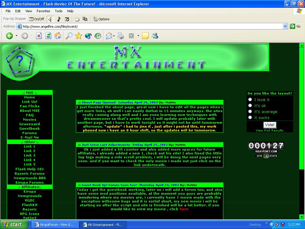
That is what your site looks like on my resolution. I don’t like your site (which seems to be the overall consensus). My opinions on it:
We’ll start large and work our way smaller.
-
Color scheme. Too hard on the eyes. You don’t want your viewers to get a headache when they come to your site. You may like it, but many people don’t. You need to do some research on color theory. Bright green like that is definately a “web-design no-no” You want colors that blend and create harmony, not colors that jump off the page and scream at the viewer. I personally would change the color scheme to something more gentle.
-
Constrain the width of your site. On monitors with larger resolutions you get huge gaps in between the tables.
-
The banner doesn’t flow with the rest of the site. The color does (unfortunately) but that round bulb on the left does not. You don’t repeat this shape anywhere else on the site. Everything is square and straight except for that bulb and it breaks apart the continuity of the page.
-
Continuing with the header, the blue does not mesh with the rest of the colors. They look nice and I suggest following those colors as a possible color scheme.
WHAT THE F***!? ok now i see why u guys say my site looks bad , here is what it looks like on my computer. ill update in a second. GEEZ no wonder everyone thinks it looks bad.
geez no wonder everyone thinks it looks awful, something is wrong for sure, ok here is what mine looks like.
you need to constrain the width of the site.
Place the entire site inside of a large table and give it a width value of something less than 800.
like I did here:
can you tell me how i would do that in dream weaver?
*Originally posted by Jubba *
**Place the entire site inside of a large table and give it a width value of something less than 800. **
It doesn’t matter if you use Dreamweaver or notepad. You know how to make tables right? Put the entire content of the site into a table.
you see, i try to copy and paste the entire thing into a table but i can’t line it up with the site border. i don’t do my site in code anymore i find it too confusing.
ok try going to http://www.angelfire.com/film/mxent/indextest.html
aaah ok i tested another res and you were right , all i got to do now is configurethe table properly and fix this problem, thanks a lot!
looks much better. Can you move that hit counter to the bottom? it would look better down there…
ok ok i think i fixed it, guys try looking at my site now, oops sorry for the quadruple post.
where to the bottom, where it sais copy right??
just above the copyright notice is where I would put it.
thanks a lot, i really improved the site because of that, umm are the colors still a problem? lol , i dunno it’s weird in my computer the green really looks good, maybe my color is messed because i thought it didn’t hurt my eyes. should i just change the letter color?
I’m going to be hard to try to help you…
I don’t like the top header. Somewhere between the drop shadows being different distance and the textures being altered I lost interest. The colors also clash IMO. If this were a database driven site, I could see the minimal design working well with the HTML. But as I can see you’re using your guessbook and other things from Bravenet, so I would recommend adding some more graphics somehow. Try to spice it up a little. The RPG Icons button bg shows when u roll over Yut343 or The Hideout. Also, is it legal to have an affiliate on your list thats not affiliated with you? Maybe just change those to links perhaps. Not sure. Whatever you choose, I would also recommend opening them in a blank window. The Link Us!, Fan Flicks, FAQ, Movies, Graveyard buttons didn’t work. Hope this helps you in the future.
http://www.kirupaforum.com/forums/showthread.php?s=&threadid=16452&highlight=color+theory
http://www.kirupaforum.com/forums/showthread.php?s=&threadid=18264&highlight=color+theory
check out the links that are in those two threads. They will help with your color ideas.
*Originally posted by slayerment *
**I’m going to be hard to try to help you…
I don’t like the top header. Somewhere between the drop shadows being different distance and the textures being altered I lost interest. The colors also clash IMO. If this were a database driven site, I could see the minimal design working well with the HTML. But as I can see you’re using your guessbook and other things from Bravenet, so I would recommend adding some more graphics somehow. Try to spice it up a little. The RPG Icons button bg shows when u roll over Yut343 or The Hideout. Also, is it legal to have an affiliate on your list thats not affiliated with you? Maybe just change those to links perhaps. Not sure. Whatever you choose, I would also recommend opening them in a blank window. The Link Us!, Fan Flicks, FAQ, Movies, Graveyard buttons didn’t work. Hope this helps you in the future. **
thanks guys
as i said before the links aren’t working yet as i am still fixing the layout. once the layout is 100% good and rdy to go, i will do the rest of the site.
ya i probably will change the affiliates to links , and the yut343 i aint sure what to do, i was in dream weaver messin around trying to add more cells when i accidently did that i don’t know how to fix it , yet.
forthe color theory i will check that out but the site is called MX Entertainment, the theme is soppost to be about the matrix, how can i make a matrix theme when there isn’t any green?
http://whatisthematrix.warnerbros.com/
This is the matrix site. Do you see that green anywhere? or in large quantities when it is there?
:(, no but i don’t have any color scheme ideas and those threads you gave me, it was like being in art class and listening about the way color works.
