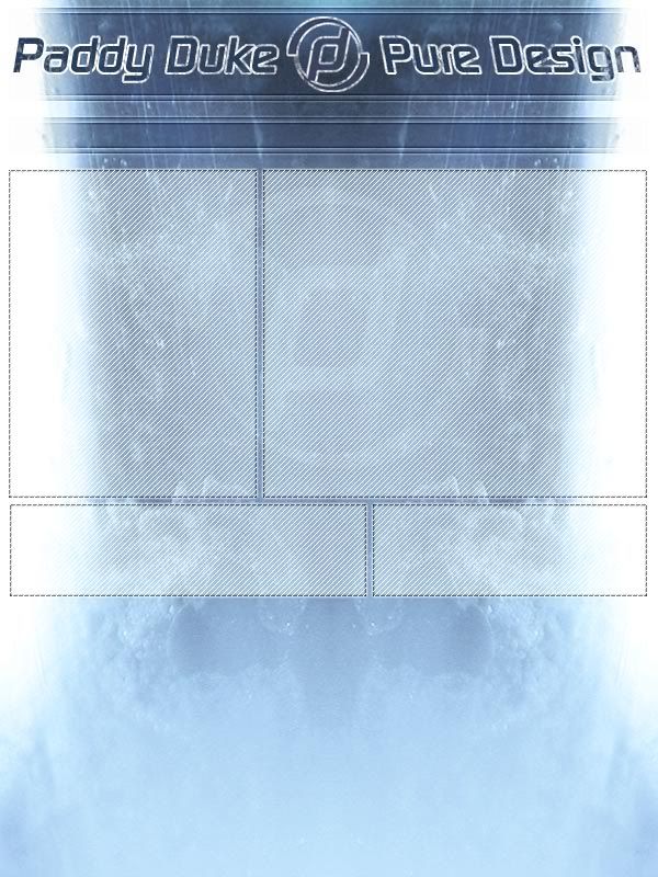
Can I get some C & C on this new layout for my personal portfolio site?
It’s very long but I’m going to have it going off the top and bottom of the screen with the scrollbars disabled. The content area is going to stay static with the content being dynamically loaded. http://img.photobucket.com/albums/v188/Fla5h/paddyduke.jpg
Here’s is the logo too for some critiques. The idea of the logo is a ‘p’ and a ‘d’ combined because my site is paddyduke.co.uk because that’s my name. I grunged it up for the layout because the site is themed in a modern/grunge style.
Wow 8 views and no replies. It can’t be that bad can it? Please don’t just leave me hangin’ here people. I need to know whether it’s worth Flashing or should I start over. Personally, I like it, but it might not appeal to everyone.
see how the colors look at the bottom of the sheet?
the ice looks muted and soft there with this nice glow - i would use that effect for the whole thing - also i would try not to just “suspend” the site in midair over the slab of ice either - try to incorporate it more into your design and create a “theme”
you are still in the beginning stages of this so its cool - but create a theme - not just a table border on a background.
BTW: That’s actually not ice. It’s a picture of milk with a blacklight effect. It was originally pink but I chose it because of it’s ice like qualities. I guess you could say I thought it looked ‘cool’. :ne:
nothing is wrong with your logo…
It just needs to be vectorized…
not too much more to say…
as for your layout. nothing bad there eather. but at the same time nothing great. “To simple/standard”. Work on your interface a bit. Your background image and header text look way too pixelated. Clean it up.
other then that
“Right ON!!!”:pleased:
From : Blake
Blake// I can’t post the image at full quality because it won’t fit on photobucket at that filesize. When it’s published to the web that pixeliness (is that a word) will be either much less noticeable or gone altogether. Also the pixelated look gives it more of the ice texture that I was going for.
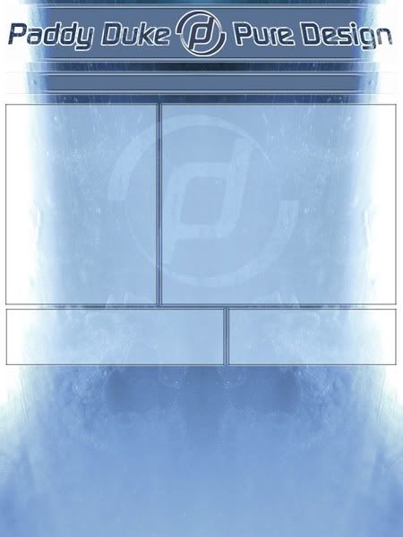
Also I made two more versions but I posted just before you. Check them out.
Welllllllll…it has potential but I’m not feeling the colour. I agree with PR about the table borders (very uncool :lol:)
I think it would look better without the boxes in the middle. You have that nice soft curve in the background and the tables look weird hanging over the edge. (if you know what I mean). Also, the title is way too big for my liking and that top dark blue box could be squeezed vertically by about half. Why not trying mimicing the top and the bottom a little more to give it some weight. I’m not saying they should be the exact same but somewhat similiar in their darkness.
i quite like the 3rd version… i know this is going to sound strange but every time i read that name i see paddy duke puke design… this is not an insult its just my strange mind
It’s very interesting and I’m a fan of the pixel design, but I’m not sure if it fits the site. Maybe try going for a thinner sleeker look. It might fit better.
I like the chunky look. Plus this is the font I think I’m ganna use on the rest of th site. I don’t want this site to look corporate. I want it to look stylish. I think making the letters thinner would look too corporate.
Hey Flash I liked the design where you had the netting graphic in front (was it version1?) but with a name like PADDY DUKE you can do some cool things with that! so many d’s you must be born for d-esign :chinaman:
I mean think of the possibilities of that name! The mind boggles.
Anyway, when I think of that name I think of sport and with the Olympics coming up - I say go with the netting and anything else sporting
If that’s the direction you’re heading with the rest of the site it should look fine. The way you had it originally done looked like more of a sleek look. I’m interested to see how it turns out!

 )
)

 I liked the design where you had the netting graphic in front (was it version1?) but with a name like PADDY DUKE you can do some cool things with that! so many d’s you must be born for d-esign :chinaman: